Pushing for accessibility
As UX designers
This article is inspired from a presentation co-written with Nora Goerne from Eleven Ways for a meetup in UX Gand about responsibility in digital design.
My career in design began with a focus on ethical design and accessibility. At the time, I had joined Women Make, a community for women makers to share their time and resources to support each other. With members all over the world, I got to learn from people who do not look or sound like me, people who don’t live the way I do and face challenges I have never experienced myself: black women, trans women, Latina women, disabled women, queer people, women from Mongolia, the Philippines, women working in the Middle East, in Nigeria, and yes, Europeans and Americans too.
The only thing we had in common was our drive to make innovative products – and possibly some experience with sexism. The products they were launching taught me about their everyday challenges and the injustices they were trying to solve in their own humble way. For instance, apps to help non-verbal children communicate, job boards catering to marginalised individuals in the tech sector, and online communities specifically for Black women in tech. The list goes on. So wanting to make a difference was the norm. That’s how I understood tech.
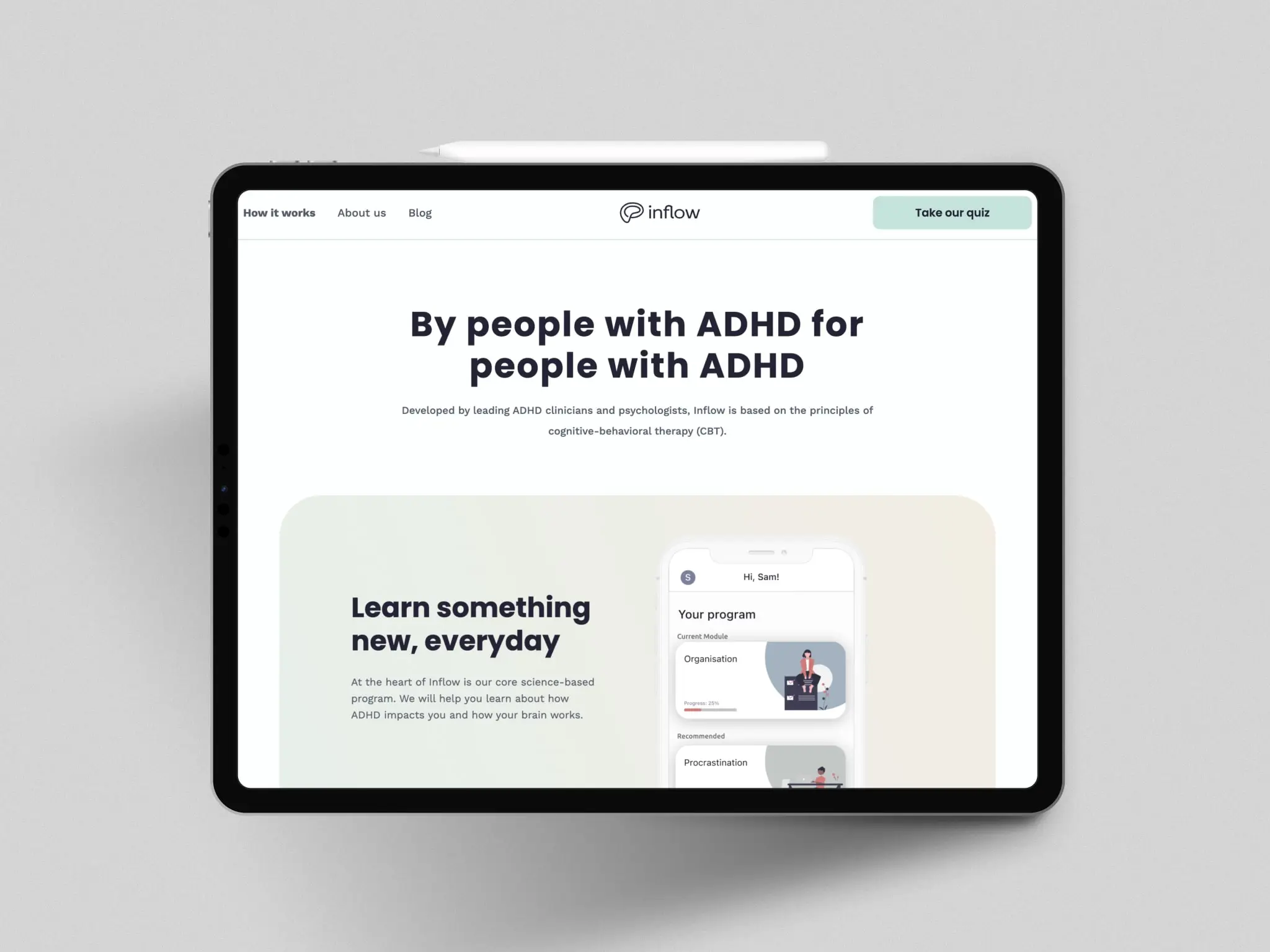
Like many people when Covid hit, I felt helpless. So as a freelance designer, I narrowed my focus on organisations supporting marginalised communities. I worked with several British charities, including a non-profit organisation supporting social justice activists. I then did a rebrand for a start-up helping people with ADHD. I only cared about working for people who were trying to make a difference.
These smaller organisations thrive on agility and innovation. Working with them gave me hope, drive and a sense of impact. My clients were passionate, convinced that everybody deserves their fair chance in the world. So accessibility was never up for debate. Their digital set up was sometimes outdated but rarely complex, so it was easy to make changes. I almost always did a rebrand before building a new site. So we managed to fix a lof of accessibility errors in there too. It was part of the design package, along with accessibility.
Pushing for change in a large organisation
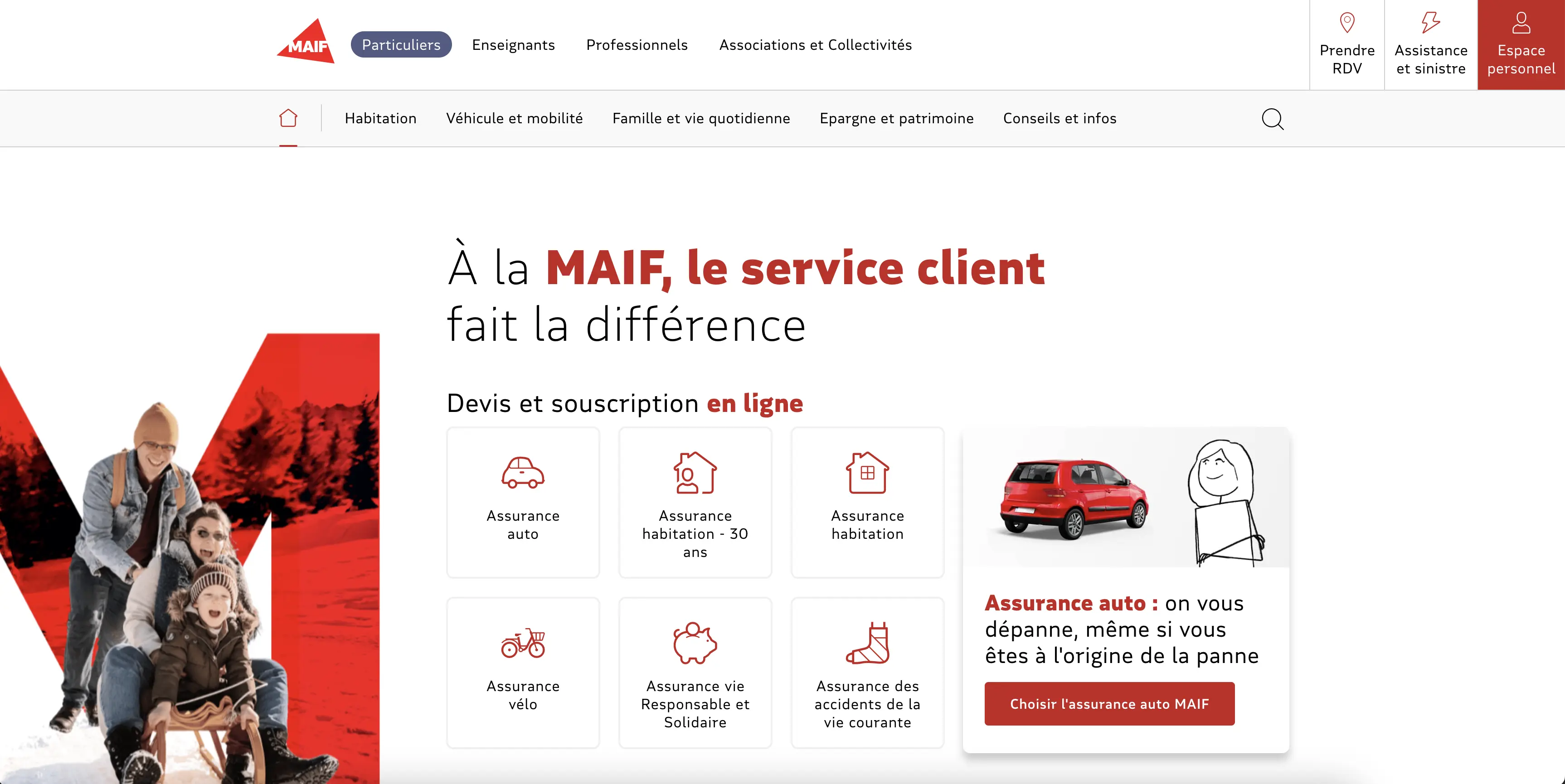
After a few years working with the charity sector, I was approached by an insurance company in France. They didn’t look like my ideal client. Firstly, they were a very large organisation. Secondly, insurance sector? I knew nothing about that. But they were interested in my focus on accessibility. I sort of expected that to be lip service but it turned out to be genuine. I was also curious about the impact I could have with a larger audience.
Transitioning from collaborating with small charities to navigating the bureaucratic maze of a corporate giant has been both challenging and enlightening.
Large corporations grapple with bureaucracy and long decision-making processes. They have complex digital set ups that aren’t easily changed. They also have fixed values and you can only hope accessibility will fit in well with the company culture. Luckily, I landed in the right place. My manager was as dedicated as I was towards accessibility and the team had implemented a solid foundation. A set of accessibility guidelines was already available, the design system was progressively updated to provide accessible components and they were working with an agency to run regular audits. In a sense, the battle was already won. Had I worked for another brand, things could have gone completely different.
Campaigning for alt-text annotations
Shortly after I joined, I still spotted a few gaps in the process, as you can expect anywhere. No company is perfect. While checking a page, I noticed an alt-text that was not meaningful for people using screen readers.

The original alt text on the red car illustration described as follows: pictogram-red-car.
People using screen readers can be overwhelmed by the noise of assistive tech. In this example, the image of the car isn’t necessary to understand the page. So it’s best to leave the alt-text empty.
I could have just asked to change the alt-text to and be done with it. But I was curious to know if this was just one isolated error or if there were more across the site. I discussed this with our lead UX designer who admitted we didn’t always annotate our designs. So developers were sometimes adding alt-text as they thought they should. That’s when I started to understand how those big companies can have inaccessible websites. Sometimes it’s a crack in the process, a lack of ownership. It’s not about so much about a lack of expertise but more about unclear responsibilities.
Winning people over
Even when you work with well-intentioned people, it doesn’t always guarantee the success of your advocacy. The longer the process takes, the more likely it is for people to find reasons to drop it. One thing that helps is to invite people to find a shared solution. It fosters a sense of ownership and motivation.
I discussed the issue with the other designers, we shared tips on how to write a good alt-text, and when to leave it blank. We also discussed a common solution to annotate designs in the same way everywhere across teams. Most of them had been there longer than I had, so I learnt a lot from them in return, particularly on the way they organised their designs. We wanted to improve accessibility on the company’s website but we also cared about anticipating the future technical debt. A debt someone would eventually have to pick up at some point.
Accessibility can be intimidating. There is a lot to know, and the more you learn about it, the more you realise how little you know. The questions of my colleagues challenged what I thought I knew and forced me to dig deeper. I needed to be absolutely certain about what I was recommending. But in the end, we implemented a set of accessibility annotations as part of our Definition of Done.

Industrialising the process
After designers had found a way to annotate alt-text, we also needed to make sure our colleagues would report the annotations in specs and would use them in the code. So I went on and talked to developers, project managers, scrum masters, engineers and testers. Everyone involved in the production chain had to know about this. Which is also why change doesn’t happen fast in large organisations. This first campaign took about three months in total. But it felt incredibly rewarding.
Because alt-text matters, it accounts for 61% of all homepage accessibility errors. It was important. And something I could help fix as a designer.
Accessibility annotations for designers
Later on, I found other things designers could anticipate. I was lucky that an audit report came back at the same time to support my claim. It always help with your credibility!
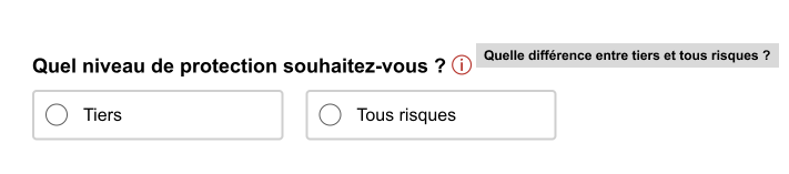
Sometimes the default accessible name of an element does not accurately describe its contents. In our components library, we could find it on an information icon.
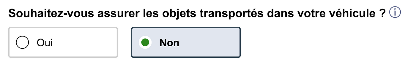
The question asks about special coverage for transported objects in a vehicle, whether the person wants to subscribe for it or not. The information icon has a link that opens a pop-in window containing details about the option.
To make this accessible, we needed to annotate a brief summary of the pop-in window and code it into an aria label. So my colleagues and I went through the same process, sharing information on how to write aria labels, how to annotate them and making sure everybody got the memo. I’d say this time it took about a month, things were getting faster.
Working as a group rather than imposing my solution on others helped us get creative. A colleague of mine suggested we used those aria labels in a title attribute as well. This would help anybody hovering over the information icon to get more context about the pop-in. So as we worked on an accessibility feature for users of screen readers, we also thought of things to improve the experience of non-disabled users. And that’s the beauty of it. You don’t deteriorate your design by improving accessibility, on the contrary.
If you want to know more about accessibility annotations for designers, I strongly recommend Stéphanie Walter’s presentation on the subject. Because, obviously, alt-text and aria labels are not the only thing to think about.
Accessibility can’t depend on good will only
This is a long piece to tell you how I’m pushing for accessibility in a large organisation, one alt-text at a time. I hope it gives you some clues about what to pay attention to, and how to go about it as a team.
I recently shared this story in a meetup about responsibility in digital design with Nora Goerne at UX Ghent. In her part of the presentation, Nora explained how accessibility is also about change management. And that doesn’t just happen from annotating design.
Accessibility training, for who?
A business can’t rely on one individual’s good will only to improve accessibility. We can’t expect people who are not designers to know what to do. Think about your colleagues in the marketing department, people sharing dashboards of data. Should they also train in accessibility? That’s probably not realistic for every role in a business.
Tools to produce accessible content
Think about People, Processes and Tools. All three aspects need to be taken in consideration as part of your accessibility strategy. If we use tools that don’t allow people to produce accessible content in an easy way, it also has an impact on our internal documentation. And that has an impact on the inclusion of disabled colleagues.
Disabled people have valuable feedback
It is also essential to test your design with disabled people and invite them to participate in user research. People who rely on accessibility on a daily basis already know where the gaps are.
This works for people with disabilities, as well as anyone from a marginalised community. When in doubt, transpose the issue with a community you can relate with. Imagine you were left out because you’re black, a woman, a non-native speaker. Anything that resonates with you. Mike Monteiro said it best:
“As designers, we are tasked with solving the problems of the world. And the more we, and those we look up to, reflect the face of the world around us the better our solutions will be. If we continue to behave like it’s a white man’s world we’re not only doing ourselves a disservice, we’re doing our clients a disservice, and ultimately we are doing our craft a disservice.”
Publication date